

 admin
admin
Websites got responsive to commemorate the mobile-first strategy. Businesses know the importance of the mobile-first approach and they are now seeking help from a professional responsive wen design agency to create a responsive user interface for their websites.
There are a total of 1.94 billion active websites on the internet currently. When you are up against so many websites, you need the best of UX to gain traction and traffic. This is where responsive design can help you.
What is a Responsive Web Design?
It is a design approach that helps designers to achieve higher user experience through interactive and highly responsive features in web design. Here, we are discovering some ways in which you can create an excellent responsive web design.
-
Bootstrap:
Bootstrap is one of the most popular HTML, CSS and Javascript framework with tools to develop a full-fledged responsive website from scratch. It has several containers, elements and many such design components that can help you create menus, navigation bars with other important UI components to achieve highly-responsive websites.
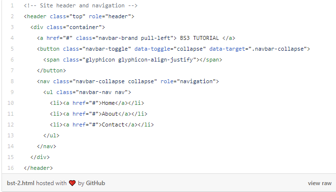
Here, you can see how to create a responsive navigation bar for your website with the addition of HTML code within the <body> tags in the index HTML.
-
Flexbox:
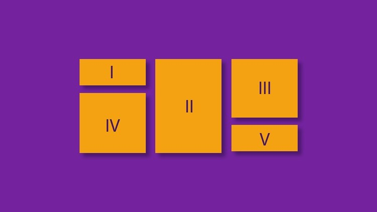
A tool that can help you create excellent responsive UI through display property of CSS. It has two basic components called block elements and inline elements. Block elements stacks in the vertical direction, while inline elements always stack horizontally. Flexbox helps you stack these elements in the direction most suitable to your setup. It keeps these elements evenly spaced and squeezed in a section on the webpage.
Flexbox acts as a container element, that can hold several element items like block and inline elements.
-
Typography:

Typography is essential to your responsive web design as it enhances the user experience. Any text on your website needs optimizations to adjust to different screen orientations. Typography helps your text optimization needs with several tools.
If you are considering a mobile-first approach, the text should be optimized to a size of 16px to 1em with adjustments in headings. You also need to optimize other text on your website with the use of legible fonts for better traffic and traction.
-
Buttons:

Buttons or clickable buttons are the elements on your website that can help you bring business. CTAs or click to action buttons can be used to enhance the UX and achieve greater traffic towards your business. You can use these buttons with padding to increase the clickable area and leverage the material design to optimize access to buttons. The size of the buttons should be kept up to 36dp to enhance the UX.
-
Micro Interactions:
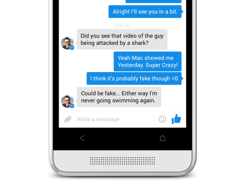
Micro-interactions are micro-events that takes place in every section of your website. But, these events are interactive and produce a real-time one to one interaction between system and user. Many responsive web designers use animation for enhancements in the micro-interactions. These enhancements can help achieve.
- Better communications and feedback
- Direct manipulation enhancement
- Easy access to immediate results in response to user action.
- Enhancing the sense of direct manipulation
- Helping people to see the results of their actions
Signing Off:
Responsive web design is business’s most essential part today . As there are several different mobile OS, devices and screen orientations to counter with your website, you need the best responsive web design service to achieve that responsive web design. So, if you are looking for a highly responsive web design, look for the above tools to make designing easier and attractive.


Comments
0 comments